
Template
E-Commerce Business Overview
Combine your Shopify, GA4, Google Ads, and Facebook data for insights across your business.
.svg)
Data can be presented in so many different ways, but here are 10 of the most creative ways to wow your audience.

Polymer Sites use advanced AI algorithms to analyze your dataset and transforms your Excel spreadsheet into a customizable, interactive search engine & web application.
FlixGem is a Polymer Site built with this spreadsheet:

Sorting Feature: You can sort movies & shows by IMDb score.
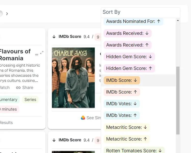
Similar Results: Find shows according to your tastes, powered by AI insights.

Query Data: Filter data by tags such as genre, sub-genre, length, director, writers and country availability.
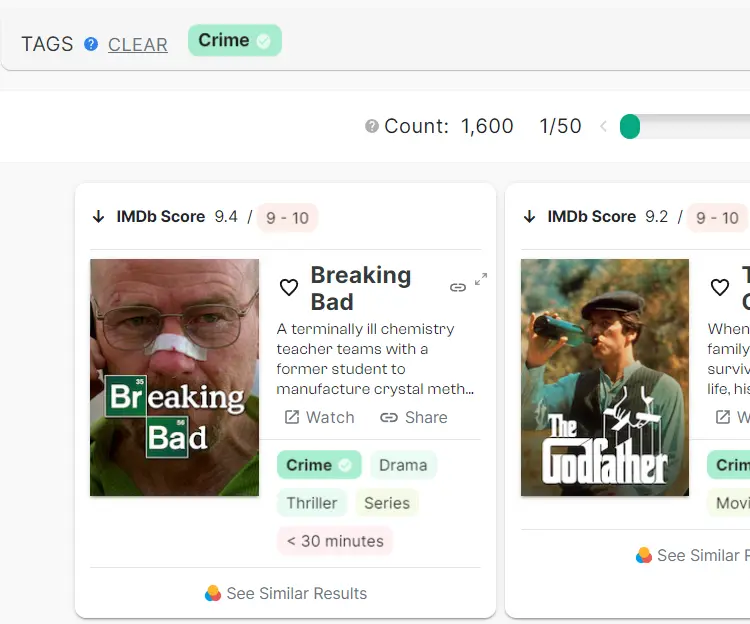
Interactive web applications like this can be created in a matter of clicks:
Hand-drawn animations are the best way to tell a story with your data. They are extremely popular amongst big corporations, but did you know you can actually create these for a very low cost?
Animating is usually the most expensive process in hand-drawn animations, but Doodly allows you to use pre-drawn assets which you can just drag & drop onto the scene.
Interactive infographics are intriguing, attention grabbing and are one of the best ways to draw your audience in and keep them engaged.
For marketers doing outreach, interactive infographics are one of the best ways to set yourself apart from the competitors who are all pitching the same thing.
ThredUp is an online, environmentally friendly clothing store which created this interactive infographic to measure your carbon footprint:

It uses a combination of survey questions and sliders:
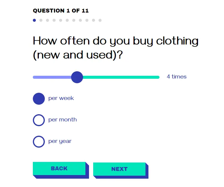
Results: The results page puts things into perspective and also gives advice on how to lower your carbon footprint.

The most common way to create interactive infographic pages is through a vector based illustration software like Adobe Illustrator. Then the page can be programmed using JavaScript and HTML. However, this requires some technical skills.
For those looking for an easy way to create interactive infographics, Genially is a great tool.
Animated infographics have the advantage of having background music and voice-overs, allowing you to tell a story better than standard infographics and even interactive ones.
Vox created this infographic to show the decline of American democracy. The combination of music and narration makes this almost like watching a movie or documentary.
If you're a designer: the assets can be created in Photoshop whilst the animations can be done with Adobe After Effects.
If you’re not a designer, Visme is a great tool for creating animated infographics with no skills required.
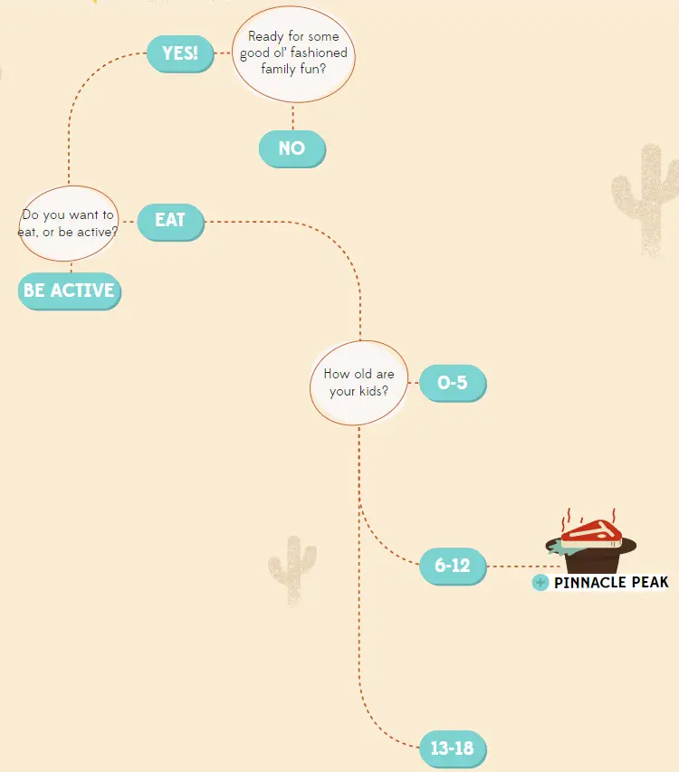
Although not directly related to presenting data, an interactive flowchart can be extremely valuable for teaching purposes and helping people make data-driven decisions.
This flowchart was designed for Marriott, a hotels & resorts booking company. Sometimes static flowcharts can become really messy due to information overflow, but interactive ones only show information that's relevant to the user:
Similar to interactive infographics, Adobe Illustrator is used to create the assets, and the web-page can be programmed using JavaScript and HTML. However, this requires some technical skills.
Genially offers an easier way to add interactivity to your data, meanwhile static flowcharts can be created through diagrams.net.
The old fashioned way of presenting data is through powerpoint slides where each slide is an image of a static chart/graph.
The modern way to do things is through dynamic dashboards where we can update the data in real-time.
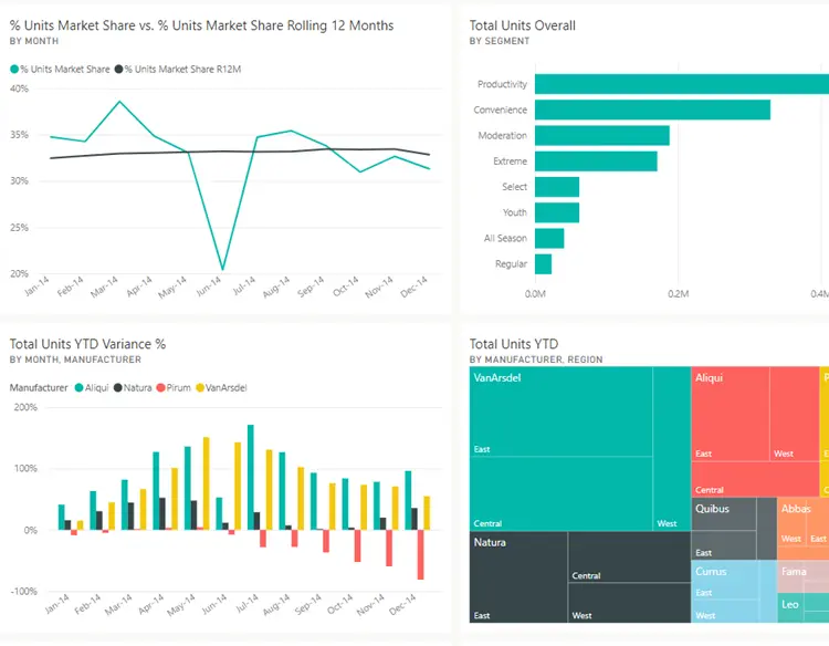
Tools like Tableau and PowerBI allow you to program your own dynamic dashboards with the DAX language (data analysis expressions).
You can also refer to our guide on how to create dynamic dashboards in Google Sheets.
Alternatively, Polymer is capable of creating simpler dynamic dashboards with no-coding required.
GIFs allow you to create short, punchy animations that make a clear statement about something.

To create high quality GIFs, the only program you'll really need is Adobe After Effects which allows you to create digital effects and motion graphics. This requires some design skills however.
An alternative way is to use Giphy, which allows you to upload images and add animations on top of them. It also allows you to convert video files into GIFs.
Timelines are useful for presenting business data, and showing how performance changes over time.

Diagrams.net is an online web application that allows you to create many different charts, including the timeline you just saw. Using it is very intuitive and doesn't require much explanation.
Overlaying statistics over images or real objects is a fancy way to present data and allows you to be as creative as you like.


Photoshop or GIMP are the tools for this. First acquire the assets (e.g. the photograph of the banana or outline of the human body). Then use these tools to add in the overlays and labels.
Interactive web apps allow users to not only see the data, but input their own information into the app.
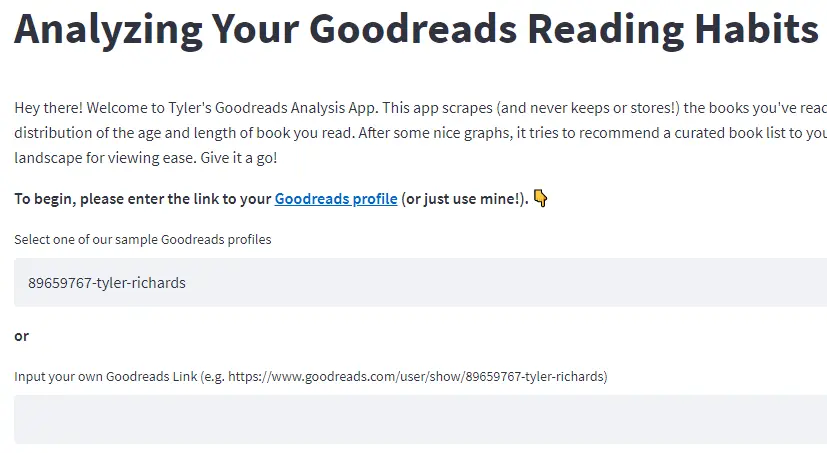
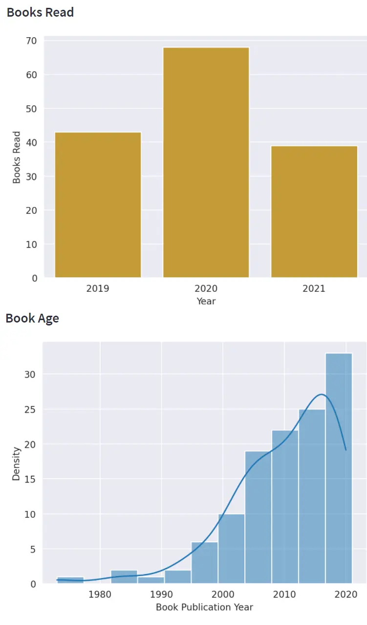
Apps like the above can be created using Streamlit which removes a lot of the front-end design hassles. Although some python knowledge is required, you can learn to build an app within days.
Storytelling is a potent tool in capturing attention, and when combined with data visualization, it can effectively convey complex information. By weaving a narrative around your data, you create a memorable visual experience. Tools like Tableau and Power BI allow users to build compelling visual stories by juxtaposing charts, graphs, and annotations. Remember, the goal is to guide your audience through the data, emphasizing the essential points and evoking emotion where necessary.
With the rise of AR technology, presenting data has entered a new dimension. AR tools can superimpose data visualizations into the real world, allowing users to interact with data in a more immersive way. Imagine walking through a virtual forest where each tree represents a data point, or visualizing sales data as towering skyscrapers in a cityscape. Platforms like ARKit for iOS or ARCore for Android have made it easier for developers to integrate AR visualizations into mobile applications.
Great data visualization comes down to experience and knowledge of when to use each presentation method. For a scientific look at when to use each chart, graph, diagram, we recommend reading 'The Visual Display of Quantitative Information' by Edward Tufte.
See for yourself how fast and easy it is to uncover profitable insights hidden in your data. Get started today, free for 7 days.
Try Polymer For Free


.svg)


.webp)

.webp)

