
Template
E-Commerce Business Overview
Combine your Shopify, GA4, Google Ads, and Facebook data for insights across your business.
.svg)
Learning to analyze data in Excel can seem like a complicated task. After all, Excel has a poor UI and its system is so large that it's easy to get overwhelmed. The good news is the process is much simpler than you think if you break it down step-by-step.
.webp)
Most of the functionality in Excel you won’t ever use. They’re just there for edge cases you might come across. And that’s the great thing about Excel. It’s such a huge system that it’s very flexible for your data analysis needs.
You just need to learn the core use cases and look up guides when you need to.
To get started in data analysis, here’s what you need to know:
Despite being easy to learn, these are extremely useful data analytics techniques for all levels of data analysts. As a data scientist, I still personally use these day in, day out.
Pivot tables are ultra important for all kinds of data analysis ranging from sales/marketing data to HR data.
But what exactly are pivot tables? In a nutshell, if you have questions about your dataset such as “which products are generating the most sales” and “who are my most loyal customers,” a pivot table will allow you to quickly answer those questions.
Example of a Pivot Table:
Let’s say we have a dataset like this:
With a pivot table, we can quickly summarize that there are 2 reds, 2 blues and 2 greys and 1 green car without having to manually count them.
How to create pivot tables:
Numerical measurements should go into the values field. Stuff like: Profit, revenue, number of sales.
Categorical variables should go into rows and columns. For instance, if you’re trying to figure out which products are generating the most sales, you put “products” into columns. Most times, columns are preferred over rows, although you can use these interchangeably.
Since pivot tables are such a crucial component for most data analysis tasks, I highly recommend you do some practice with pivot tables.
You can find sample datasets to practice with on Kaggle. Otherwise, I’ve created some practice questions on Polymer Search.
For a more detailed breakdown of what a pivot table is and how to create one, I recommend you check out my guide: pivot tables for beginners.
Data visualization isn’t just for presenting data, it’s useful for visualizing trends, correlations and patterns in the data.
For most analyses, the three most important charts are:
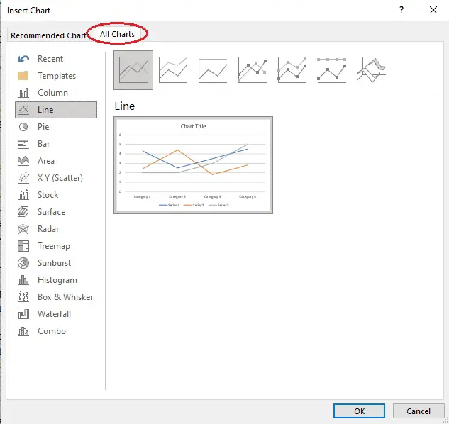
Select the data you want to visualize.
Go to the “insert” tab. This is where most of your data analysis tools will be including charts and pivot tables.
Choose “recommended charts” and pick the one there if it suits your needs. Otherwise, go to “all charts” and find a suitable one there. There should be plenty.
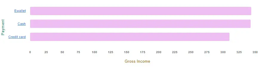
Bar charts are the bread and butter of data analysis. You'll be creating hundreds of these!
Bar charts are ideal for studying the relationship between 2 variables:
A bar chart will allow you to see the relationship between these things, for instance: how does “payment type” affect “profits?”
More advanced strategies for bar charts include slicing the bar chart.
Let’s say we want to study the relationship between a third variable: gender. We want to see whether males or females tend to spend more using ewallet, cash or credit card:
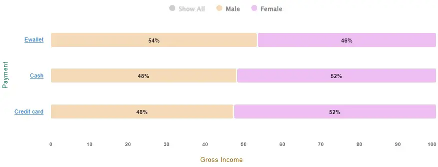
In general, slicing works better if the third variable doesn’t contain too many categories like gender.
Scatter plots allow you to see the correlation and distribution between 2 numerical variables. For instance: customer purchase power vs. household income.
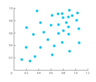
A line of best fit can be drawn to help make predictions about the data. For example: “What would be a customer’s purchasing power if their household income was $60,000?”
How to create a line of best fit in Excel scatter plots:

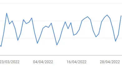
Time series allow you to analyze trends over time and forecast the future.
It’s extremely similar to a line chart, but the x-axis is always time related whilst the y-axis is a numerical variable.
Example of a time series that clearly shows that website traffic dips during the weekends:
Similar to scatterplots, a trend line can be drawn to make business predictions (often for forecasting sales).
To create a trend line in a time series graph:
One of Excel’s biggest strengths is its ability to manipulate data in almost any way you want.
There are over 475 Excel formulas!
No other tool can compare to Excel’s ability to manipulate data however you want, unless you start coding using R or Python which can take months to learn and are unnecessary for most people..
Although 475 formulas might seem like a lot to learn, you don’t need to learn all of them. Instead, most Excel professionals just look up the formulas when they need to. Google is your best friend here.
The most basic arithmetic functions you’ll need to learn are:
SUM, COUNT, AVERAGE and MEDIAN.
=SUM(A1:A50) will tally up all values from A1 to A50. COUNT, AVERAGE and MEDIAN are structured the same way. Remembering how to write these will save a lot of time from having to look them up on Google.
The most useful functions in Excel are the CountIfs and SumIfs functions:
Overall, data manipulation and cleaning will differ from task to task. Depending on the dataset, you might have to look up formulas whenever you need them.
Here's how to analyze data in Excel:

You can perform ANOVAs, t-tests, z-tests, correlations, regression, descriptive statistics and more.
Note: The Analysis Toolpak is designed for people with intermediate statistics knowledge, but is capable of performing complex analyses.
Using the analysis toolpak, you can perform factor analysis in Excel.
Factor analysis is a way to break down large datasets by combining multiple variables together. The key to factor analysis is to find covariance.
Covariance means you’re looking for variables that strongly correlate to each other e.g. household income and willingness to spend might strongly correlate.
Once you find these, you can group these variables into a single factor “purchasing power.”
If you’ve ever tried to analyze big data in Excel, you’ll notice that by performing basic functions such as Vlookups will cause the program to freeze then crash.
Excel isn’t meant for handling big data. Each spreadsheet has a limit of one million rows and even if your spreadsheet doesn’t go over this limit, there is a chance the program might crash during the calculations, wasting valuable time.
Luckily there are plugins and Excel spreadsheet templates for this. Power Pivot is a plugin that allows you to process over a million rows in Excel.
It’s set up for big data analysis, as it’s faster and you can connect data from multiple sources.
There are several places you can go for sample datasets for analysis. Here are 3 places:
Data analysis might seem confusing, but once you dive into practice and experiment with stuff, you’ll pick it up really fast!
Excel is a fantastic tool for data cleaning and manipulation, but overall, it's easier to analyze your data through a tool like Polymer Search. You can think of Polymer as an "add-on" layer for Excel: You just upload your Excel file onto Polymer or start with our Excel Dashboard Template and it'll transform your spreadsheet into an interactive, user-friendly, database ready for analysis. Using CSV? Build live reports and dashboards with your CSV data and Polymer!
Analyzing data on Polymer is multiple times faster and more powerful than Excel, and best of all, you won't experience data fatigue.
Upload a spreadsheet to Polymer and get started analyzing your data like a data scientist.
See for yourself how fast and easy it is to uncover profitable insights hidden in your data. Get started today, free for 7 days.
Try Polymer For Free


.svg)


.webp)

.webp)


